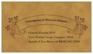
Here I go again – trying to figure out how to create the perfect business card.
And I NEED some help.
So….I thought I’d call on you faithful suscribers to get your opinions.
I have two cards I like, but don’t know which to pick. One is more professional, the other more fun.
Card A (currently my husband’s favorite)
Card B (two of my kids’ favorites- they said it was cool and funny)
Okay – here’s an additional fun one (C):
Last one (D)
AND FINALLY choice E
I’d LOVE your thoughts 🙂
Thanks a bundle.
Pepper


Without a doubt, hands down card one. Your husband knows what he is talking about. 😉
Agreed. Card One.
I’ve used both http://www.123print.com and http://www.vistaprint.com
They have lots of templates if you need more ideas.
You asked so… 🙂
Now I’ll ask you!
What do you want the recipient to immediately know about you?
What image are you trying to convey?
Quick aside: Our family had a good friend who was an interior designer. She mentioned in passing once that a great way to get an idea of the style you like is to go thru magazines (or whatever resource) and collect images that appeal to you. You might not even know why. But collect 100 or so.
Then review and see what they have in common.
I was AMAZED.
So perhaps that’s an idea for you?
Anyway, I like the “feel” of card A and it fits well with your genre it seems.
It’s a little dark. Unless you write “dark” – which I don’t think you do…
Maybe make a fru-fru frame around your photo. It’s sorta stuck on there, with square edges, etc. and doesn’t really fit the soft feel of the card.
I really like the ribbon/flower design on the back and of course, your AWARDS!!! WAHOO!The layout could be tweaked though. Maybe put some embellishment between them or as bullet points… ??
The other one is cute but way too contemporary (I think) for what you write…
Then again, perhaps that is the image you wish to convey.
Might you have 2 cards, depending on the occasion?
Or more?
Pricing on printed materials these days is SO affordable…
Have fun! Going to be interesting what you decide!!!
Be sure to show us!!!
FABULOUS question, KC
(you wanna write a guest blog for The Alley on business cards? Seriously!)
This card will be for my contemp romance (comedy) and my historicals. I’d have NO problem picking #1 if it was only for my historicals, but the card with the ‘shakers’ is an attempt to show my funny side. Oooo, decisions! Isn’t there a nice middle ground somewhere 🙂
Just a thought…should you say “double” Genesis finalist??
I guess I’d choose one, though I don’t think you’d go WRONG with either. But your face shows up better with competition from other pictures.
Canr #2 is fun though.
Pepper,
They’re both beautiful. But I think I agree with your kids. I like the salt and pepper shaker idea. It goes so well with your tag line. BTW, do I get a copy of the winner for casting my vote? 🙂
Difficult choice! I’d go with the first (A)–it is very professional looking. But I do love the play on your name with choice B. Wish you could put a miniature salt & pepper drawing in the right lower corner of A. I like the fact that A has your status in the three contests too.
I like the first one best. And I love the font you chose for your name. 🙂
I vote for the second one.Yes, the first one is professional looking but it doesn’t grab a person’s attention like the second one. Give that card out and everyone will remember you. It’s original, colorful and fun and everyone will remember who you are!
I’d have to choose Card A as well! Very classy!
Where did you get your designs?
Sue
Card A is more elegant but still uses the tagline that is fun.
I almost said A, but I changed my mind. Lots of writers have professional cards with nice headshots, but you’ll be remembered for the shakers. and that’s branding, that’s leaving a mark. So I vote for B. Still looks professional. Maybe add the genesis to that. Not as into the third one.
I like them all, but I’m going to remember the card with the shakers…not that I wouldn’t remember your name, but it’s fun and clever. Like you!
LOL! Still like card A. 😉
Hi Pepper,
I like the very first one. A
I love B!! Sweet. Maybe I should change mine to gardening tools. Lol! For real, I like B. It’s looks professional while at the same time portrays the fun side of your personality.
I agree with those who said A. is a really classy, professional card, but B. is memorable. I’d go with memorable! : )
April and Deb –
I Love B, because of it’s memorable-ness (word???) and its’ fun. Deb knows me. Does it fit? 🙂
Number one. Simple, yet elegant. I don’t know that the average bear will make the connection between your tag line/name/the s&P shakers. It’s a little cutesy. Not as professional IMHO.
I love the elegance of Card A…but Card B is very creative and very memorable. You have a great name, make the most of it!!!